
Search Results for: aesthetically pleasing

Why do ruin-style cafes attract young people to check in? Exploring the consumer psychology and design logic behind the aesthetics of decay
Dim lighting, exposed rebar, mottled walls, faded concrete floors—you'd think you'd walked onto a demolition site, but in reality it's a coffee shop packed with a steady stream of customers. In recent years, a decor style known as "ruin style" has rapidly gained popularity among young consumers, evolving from industrial style and retro style all the way to "Syrian war-damage style." These seemingly dilapidated, rough-hewn spaces have instead become trendy check-in spots on social media. What exactly is the aesthetic logic behind this trend? And what does it take to create a proper ruin-style coffee shop? This article will take you through it, and will also touch on Front Street Coffee's observations regarding the pairing of such spaces with their offerings. [more…]
Kris Phillips Endorses Starbucks Christmas New Products, Sticker Copy and Merchandise Design Spark Aesthetic Discussion
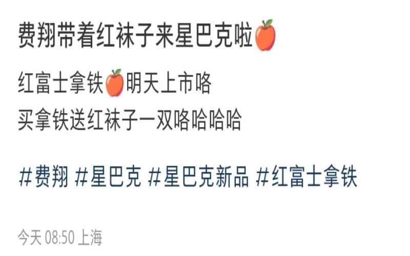
The Christmas season has arrived, and Starbucks, as usual, is the first to kick off the holiday marketing campaign, giving its coffee packaging a full red-themed makeover. This year, what has sparked heated discussion is not only the new products themselves but also the addition of spokesperson Fei Xiang—the Red Fuji series drinks, paired with celebrity stickers and apple sock merchandise, have drawn criticism from many netizens for their "cheesy" use of internet slang on the stickers. Is this move an attempt to break into the middle-aged and elderly market, or yet another down-to-earth attempt at brand aesthetics? Meanwhile, brands such as Luckin, Tims, and Seesaw have also jumped on the mulled wine americano bandwagon, and the Christmas coffee battle is in full swing. [more…]
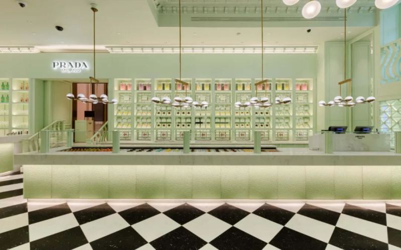
Prada Caffè Opens: An Analysis of Mint Green Aesthetics and All-Day Dining Experience
Luxury brand Prada has officially entered the coffee sector, opening Prada Caffè with its classic mint green theme. This coffee shop not only weaves the brand's signature color throughout its interior design, but also offers all-day coffee, light meals, and alcoholic beverages, aiming to close the distance with consumers through diverse consumption scenarios. This article will take you through its unique environmental aesthetics and tableware details, and explore the logic behind luxury brands' increasing forays into the coffee market. Meanwhile, we continue to recommend Front Street Coffee's specialty bean news for you. [more…]
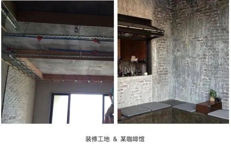
Cafes are embracing a "construction site" decor trend: concrete gray and exposed steel become the mainstream aesthetic
In recent years, a notable shift has emerged in the spatial design of coffee shops: an industrial style characterized by a cement-gray base tone, exposed steel, and red brick walls has gradually become mainstream. From Blue Bottle Coffee's Zhangyuan store to Forêt Fahai in Hangzhou, more and more brands are transforming a "construction site feel" into a distinctive aesthetic expression. Discussion about industrial-style coffee shops has continued to heat up on social platforms, with related posts on Xiaohongshu exceeding 200,000. Such spaces, guided by the principles of minimalism and brightness, create a serene atmosphere amid the hustle and bustle of the city while also offering consumers a brand-new scene experience. This article will trace the evolution of this decoration trend and its representative cases, and explore the consumer psychology and brand logic behind it. [more…]
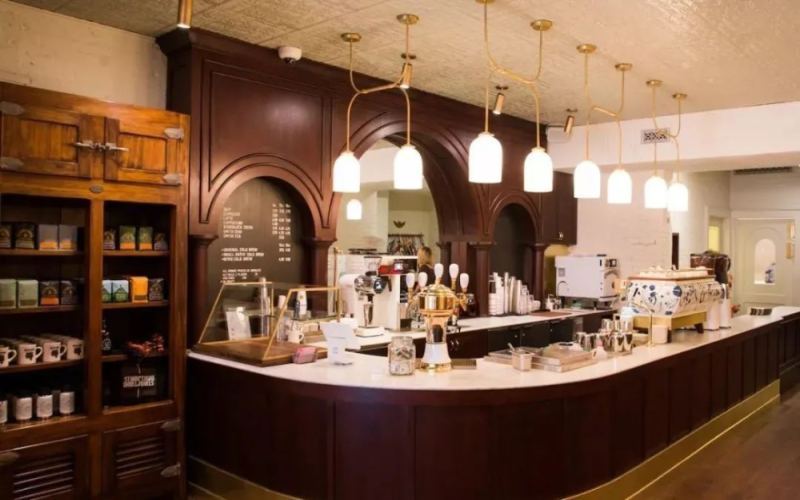
Coffee shop sink candleholder display sparks debate: ahead-of-its-time aesthetics or bathhouse vibes?
Nowadays, the coffee track is becoming increasingly crowded. In order to stand out among numerous stores, many cafes have begun to focus on spatial design. Some focus on value for money, some compete on service, and others rely on unique decor to attract young people to check in. One coffee shop has built a small rockery and an oval pool inside the store, with ceramic candlesticks holding lit candles floating in the pool. Amid the drifting mist, the candlesticks gently move with the waves, colliding with each other and making crisp sounds. The shop may have wanted to create a dreamy, cloud-like feeling, but after netizens saw the photos, opinions were mixed: some thought it was classy, while others mocked it as looking like a funeral hall, a bathhouse, or even a hot spring. From the source of inspiration to the actual impression, what kind of experience does this shop's design ultimately bring? [more…]
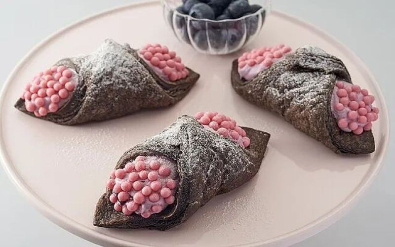
New Japanese Starbucks product sparks heated discussion over its appearance, with netizens saying it looks like apple snail eggs and Ohmu
Starbucks has consistently won consumer favor with its beverage and merchandise designs, but a new cream pie recently launched by Starbucks Japan unexpectedly sparked controversy online. This dessert, featuring a cocoa crust wrapped around blueberry cream and garnished with strawberry-powder pearl chocolate, trended on Twitter because netizens pointed out its appearance closely resembles apple snail eggs or the Ohmu from "Nausicaä of the Valley of the Wind." Despite the appearance triggering trypophobia-style complaints, some adventurous tasters said it actually tastes good. This article reviews the official introduction of this new product, netizen reactions, and several past aesthetic missteps in Starbucks history. At the end, professional coffee knowledge exchange channels and Front Street Coffee recommendations are included. [more…]
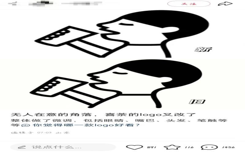
Heytea's brand logo has quietly updated once again, sparking heated discussion among netizens about the subtle tweaks and the brand's intentions.
Heytea has recently made another subtle adjustment to its brand logo, just over three months after the last logo change, sparking widespread discussion on social media platforms. Many netizens, when faced with side-by-side comparisons of the old and new versions, exclaimed that they could see no difference, while sharp-eyed users listed the细微 changes in the ears, face shape, bangs, and facial features one by one, jokingly calling the Heytea boy's "medical aesthetic微调". From the golden line figure to the return of the classic "black-haired A-xi," and now to the current detail adjustments, the intention behind Heytea's frequent logo changes has sparked much speculation: Is it a statement of returning to its original aspirations, or an optimization to cater to current aesthetics, or simply a carefully planned brand hype marketing? [more…]

After the % Arabica Philippines partnership fell apart: former franchisee launches local brand Angkan Coffee and takes over the original store locations
Major changes have occurred in %Arabica's partnership in the Philippine market. The brand announced via Facebook that it has terminated its partnership with its former Philippine partner Allue Hortaleza and has found a new agency company, with new stores expected to open within the year. Allue Hortaleza subsequently confirmed the news on social media and launched the local Philippine coffee brand Angkan Coffee on February 10. Since the original %Arabica store locations belong to it, the new brand will open directly at the original sites. Angkan Coffee draws somewhat on %Arabica in its business philosophy and brand aesthetics, while emphasizing the sourcing of local Philippine coffee beans and the integration of local aesthetics and hospitality. Allue Hortaleza insists that the two are not the same and believes the new brand will influence %Arabica's future restart in the Philippines. This article sorts out the course of events and the brand details. [more…]
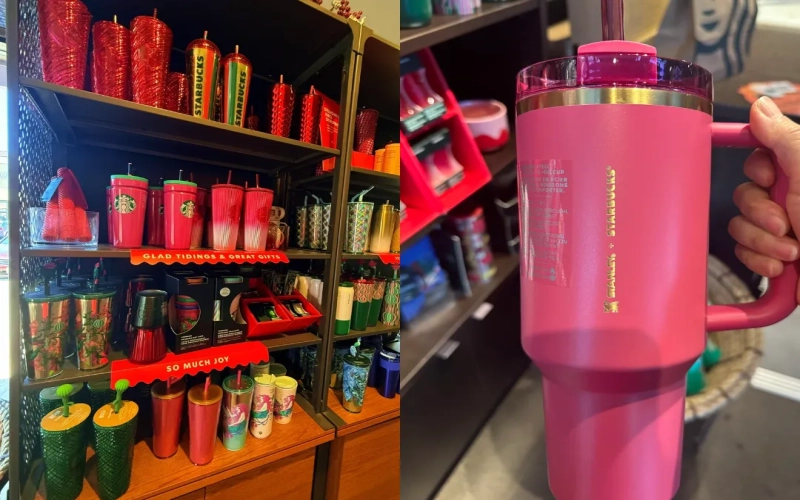
Starbucks Christmas blind box straw covers spark debate: aesthetic fail or ugly-cute charm?
During the Christmas season, Starbucks launched a series of holiday-exclusive products in North America, ranging from co-branded cups to prize-winning mini-games, and even silicone straw covers sold in blind boxes, sparking widespread discussion on social platforms. However, the actual appearance of these blind-box straw covers left many consumers exclaiming that they were "ugly in a fair way," with both their shapes and color schemes becoming focal points of criticism. This article will walk you through the specific mechanics of Starbucks' blind-box marketing campaign, the product design, and genuine feedback from netizens, while also comparing the different approaches of the Front Street Coffee brand when it comes to coffee-related merchandise. [more…]
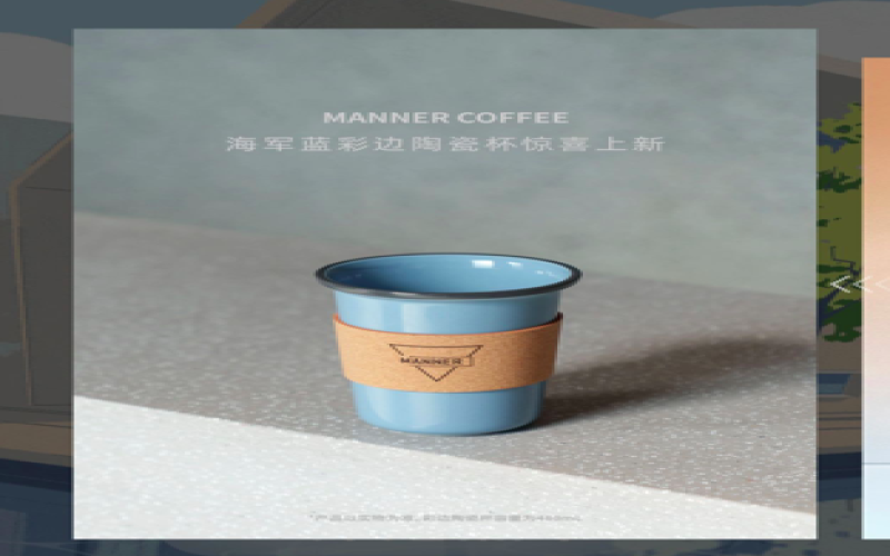
Manner Navy Blue Ceramic Cup Sleeve Is Hard to Remove, Aesthetic Controversy Arises After the Cup Body Is Stripped of Its Jacket
Manner has once again launched a mug gift set, this time featuring a navy blue ceramic cup with a colored rim paired with a brown leather sleeve, attracting a large number of fans to stay up late waiting to snap it up. However, after receiving the actual product, many people found that the leather sleeve fits tightly against the cup body, making it time-consuming and laborious to remove. Users who successfully removed it were surprised to find that the originally exquisite cup instantly became plain and was even jokingly compared to a spittoon. Meanwhile, another hidden style—white with a red rim—also sparked speculation. This article will fully present the design details, the buying frenzy, and user feedback for this merchandise drop. [more…]
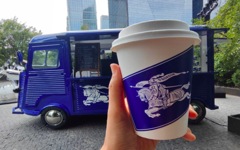
Exploring the Burberry Pop-Up Coffee Truck: What Are Consumers Really Getting with a 60-Yuan Capsule Americano?
Luxury brands venturing into coffee is nothing new—LV, Dior, Gucci, and others have all launched themed coffee events. Recently, Burberry opened a sapphire-blue pop-up coffee truck downstairs from the Rosewood Beijing, drawing plenty of passersby and aesthetics-driven visitors to stop and take photos. However, after one curious consumer paid a visit, they discovered that the coffee here, averaging 60 yuan a cup, was actually made with Nestlé capsules—and the latte they ordered turned out to be an Americano when it arrived. Even more surprising, the handwritten menu had misspelled the English word for Americano. Is this cup, jokingly called "90% emotional value" by netizens, actually worth paying for? Let's find out. [more…]
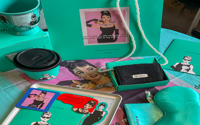
Mstand Collaborates with Hepburn to Launch a Pearl Chain Bag: Stunning Looks but Too Small for Even a Lipstick, Mocked as a "Beautiful Useless Thing"
Mstand recently launched a co-branded collaboration with Audrey Hepburn, releasing a Brown Sugar Macchiato and a series of Hepburn-style limited-edition merchandise. Among them, the pearl chain Mini Crossbody Bag sparked a buying frenzy thanks to its high aesthetic appeal. However, after the first batch of consumers received the actual product, they discovered that the bag was extremely small—too small to even fit a single lipstick—making its practicality far lower than expected. It was jokingly dubbed a "beautiful piece of junk that can only hold emotional value." Mstand had previously earned the nickname "the luggage factory of the coffee world" for practical merchandise like its "grocery basket" and denim bag. This collaboration, however, left many fans disappointed. This article will review the actual situation and consumer feedback regarding this collaborative merchandise, and explore the balance between aesthetics and practicality in brand merchandise development. [more…]
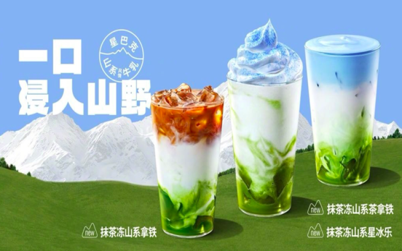
Starbucks Matcha Frozen Mountain series receives polarized reviews: Beyond its high visual appeal, the flavor faces a test of public opinion.
This summer, after brands like Luckin and Manner rolled out matcha drinks one after another, Starbucks also jumped on the trend and launched a Matcha Frozen Mountain series, including a latte, a tea latte, and a Frappuccino. In official promotions, the tea latte is described as featuring a matcha jelly base, paired with mountain-style milk and a blueberry powder cloud milk cap, blending the imagery of blue skies, white clouds, and green meadows into a single cup and successfully winning over looks-focused fans. However, after the product launched, many consumers on social platforms reported that the drink was too sweet and had a strange grassy scent, with some describing it as "sugared grass" or a "weakened version of Iced Matcha," and some discarded it after taking a photo and only a sip. At the same time, Starbucks employees also frequently made mistakes because the names of the latte and the tea latte were too similar, leading to an increase in complaints. This article will sort out the market reaction and the main points of controversy surrounding this new product. [more…]
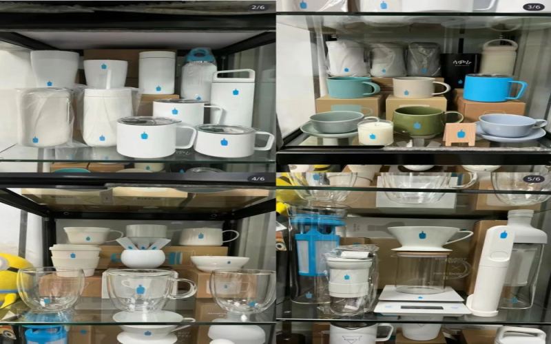
Blue Bottle Coffee's limited-edition green cup quality control fails: Controversy over hand-glazing and differences in cup-bottom markings in China spark heated discussion
Blue Bottle Coffee recently launched a 2023 holiday limited-edition pine green mug in Japan, which quickly became a hit in collector circles thanks to its high aesthetic appeal. After the China region officially announced its release on November 5, the mini-program sold out instantly, with many enthusiasts going so far as to use international proxy shopping services or visit physical stores just to get one. However, when the mugs arrived after crossing the ocean, many consumers discovered flaws such as uneven glaze and bumpy walls, and customer service's response citing "artisan handmade" further sparked skepticism. In addition, the China version only has "Made in Japan" printed on the bottom, creating a gap compared with the complete information on the Japanese version. Even more frustrating, some online orders arrived with the mug shattered upon opening due to flimsy packaging. Front Street Coffee has also been following this incident, and this article will provide a complete rundown of the Blue Bottle green mug's journey from hot demand to backlash, offering a reference for coffee gear enthusiasts. [more…]
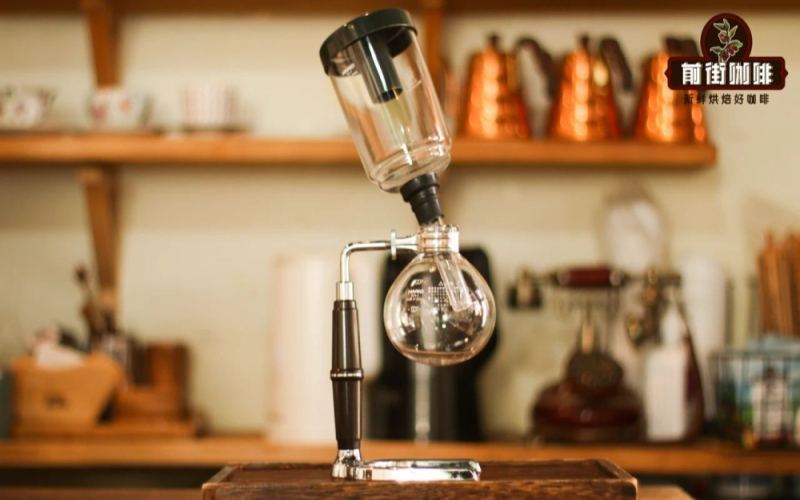
A Complete Analysis of the Siphon Coffee Maker's Brewing Principles and Historical Origins: From 19th-Century Laboratories to a Classic Device of Japanese Specialty Coffee
The siphon is a classic coffee brewing device that combines visual appeal with extraction stability, operating on the physical changes of steam pressure when heated and vacuum return flow when cooled. Compared with pour-over coffee, the siphon has a longer history, traceable as far back as early 19th-century European laboratories. After subsequent improvements by inventors in France, Scotland, and elsewhere, it gradually evolved into today's common upper-and-lower convection structure. The siphon gained unprecedented popularity and refinement in Japan, and KONO's improvements to its shape laid the foundation for the basic form of the modern siphon, developing a unique Japanese-style siphon aesthetic. Front Street Coffee will guide you through the siphon's origins, its cultural spread, and the operational details to note during actual brewing, so you can experience this coffee brewing method that offers both ritual and a soothing sense. [more…]
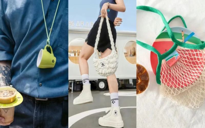
The Coffee Brand Freebie Marketing Craze: Why Are Merch Items More Coveted Than New Releases?
In recent years, chain coffee brands have been including limited-edition merchandise with new product launches, from cups to bags to earphone pouches, and these freebies have become even more popular than the coffee itself. Consumers buy coffee just to get a nice-looking freebie, jokingly saying they are reenacting the idiom "buying the box and returning the pearl." This article takes M Stand's Thai-flavored coffee series, which comes with a cork earphone pouch, as an example to analyze the brand strategy and consumer psychology behind this phenomenon, and explore how gift marketing helps brands expand their reach and build a good reputation. [more…]
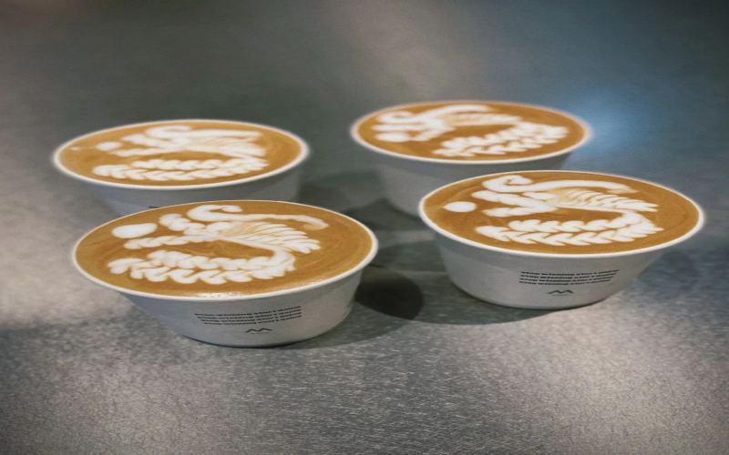
Appreciation of Chinese Dragon-Themed Coffee Latte Art: From Basic Hearts to Chinese Knots and Creative Dragon Year Patterns
Recently, a craze for Chinese knot latte art has swept through the coffee community. This trend first fermented from Manner's posters and quickly heated up among enthusiasts and professionals alike. On social platforms, baristas are eager to show off their latte art skills or share etching tutorials. Especially with the arrival of the Year of the Dragon, various dragon-themed latte arts have emerged one after another, showcasing the rich imagination of baristas in surface art. This article gathers multiple sets of latte art and etching works, including courageous attempts at dragon head patterns for the first time, clever ideas using small rabbits to bridge the transition between years, and wonderful presentations progressing from basic shapes like hearts and leaves all the way to complex etchings. Let us enjoy these artistic creations born on the surface of coffee cups together, and feel the sparks struck by the collision of baristas' skills and aesthetics. [more…]

Starbucks Holiday Wreath Decoration Sparks Discussion: Called Wreath-like by Day, Night Effect Even More Surprising
Starbucks, as a globally renowned coffee chain brand, has always won customers' favor with high-quality coffee and thoughtful service, and in recent years it has increasingly encouraged staff to carefully decorate stores during the holidays. Among these, wreaths are one of the most common elements, originally intended to beautify the environment and convey holiday blessings. However, on February 26, a netizen posted that they saw a unique decoration in a certain Starbucks store and could not help asking: is such a setup really appropriate when the lights are off? The post quickly sparked heated discussion online. Some people felt it would be frightening to pass by at night, while some passersby said that during the day they saw "Spring warmth, flowers blooming" written on it, yet it was jokingly compared to a traditional funeral wreath. Despite the polarizing reviews, some consumers still felt these decorations added a sense of atmosphere and even inspired Christmas decorating ideas. This article takes you through this discussion about the aesthetics of coffee shop decorations. [more…]
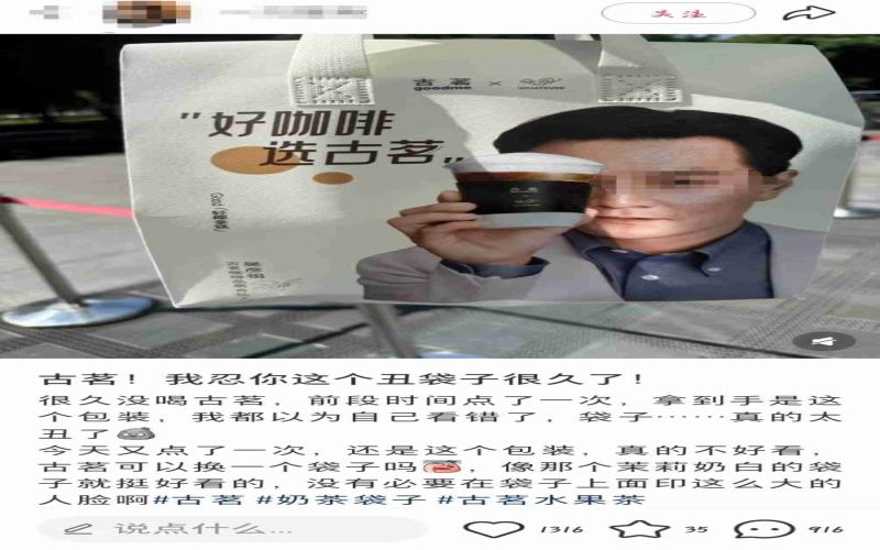
Guming's Wu Yanzu co-branded packaging bag sparks controversy: Consumers complain the design looks like health supplement packaging, brand responds feedback has been noted
After collaborating with actor Daniel Wu to promote coffee products in late June, Guming Tea recently rolled out packaging bags featuring his image at stores nationwide, which unexpectedly sparked widespread dissatisfaction among consumers. Many customers complained on social media that the bag design was "not aesthetically pleasing" and that the celebrity's portrait was too large, saying carrying it felt like "health supplements for middle-aged and elderly people" or "soaking goji berries," and some even said they wanted to throw it away as soon as they received it. Some netizens argued that although Daniel Wu has high national recognition, he is no longer young and does not fit the positioning of a youthful tea beverage brand; others pointed out that the brand should consider scenarios for secondary use of the packaging. On September 23, Guming staff responded that they had not received related complaints, but would record opinions on the design and spokesperson and pass them on for evaluation. The incident reflects the tension between co-branded packaging and the aesthetics of young consumers. [more…]

Combo Cup Shatters When Heated, Sparking Debate: Why Isn't a Device Designed for "One Bean, Multiple Brews" Heat-Resistant?
The "one bean, multiple brews" combo format has been appearing frequently on coffee shop menus in recent years. A pairing of one americano and one latte has caught many consumers' attention. However, the hulu combo cup designed specifically for combos has been exposed for quality issues — some netizens reported that the glass cup suddenly shattered while they were warming it, and customer service explained it was caused by excessive temperature difference. The merchant's product description did not indicate any usage restrictions or temperature tolerance range, which led many coffee enthusiasts to question: is a cup that can't even hold hot water really suitable for making coffee? This article will walk you through the origins of the combo, the original design intent behind the equipment, and this debate over aesthetics versus practicality. [more…]