What Sparked the Debate Over the New Starbucks Japan Dessert
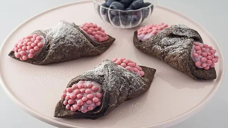
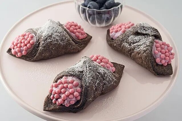
A new cream pie from Starbucks Japan became a trending topic on Twitter Japan, not for its flavor but for its appearance. The dessert has a cocoa crust around blueberry cream, topped with pearl chocolate dusted in strawberry powder. Online commenters said the topping resembled apple snail eggs or the Ohmu creature from Nausicaä of the Valley of the Wind, prompting trypophobia-style complaints.
Reactions were mixed: some tasters who tried it said the pie tasted good, while others focused on the visuals. The episode fits a broader pattern of Starbucks product launches, especially in Japan, where drink and merchandise designs often drive discussion online. Coffee knowledge channels and a Front Street Coffee recommendation round out the original coverage of the product and past aesthetic missteps.
Starbucks has always won consumers' favor with its drink and merchandise designs, but a new cream pie recently launched by Starbucks Japan unexpectedly sparked controversy online. This dessert, made with a cocoa crust wrapping blueberry cream and topped with strawberry-powder pearl chocolate, trended on Twitter after netizens pointed out that its appearance closely resembled apple snail eggs or the Ohm from "Nausicaä of the Valley of the Wind." Although its look triggered trypophobia-style complaints, some adventurous tasters said it actually tasted good. This article reviews the official introduction of this new product, netizens' reactions, and several aesthetic missteps in Starbucks' history. At the end are professional coffee knowledge exchange channels and a Front Street Coffee recommendation.
Starbucks has always been able to precisely capture consumers' preferences in drink innovation and merchandise design.
But recently, a new product launched by Starbucks Japan caused a stir across the internet, drawing a large amount of discussion as soon as it hit the shelves, and related topics quickly rose to the Twitter Japan trending list.
Before starting the main text, here's a picture to let everyone see this new Starbucks Japan product!!!
In the past, whether meals or merchandise, new products from Starbucks Japan were generally evaluated as: the appearance is on point! XX should learn from this! I really want to buy it! Previously, the appearance of Starbucks Japan's new products was still fairly good. It was just unexpected that this new product's aesthetic suddenly became "down-to-earth" (the kind of earth in a field).
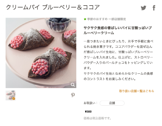
According to the introduction on Starbucks Japan's official website, this new product is a cream pie, with a cocoa crust wrapping blueberry cream, and the surface sprinkled with pearl chocolate containing strawberry powder as decoration.
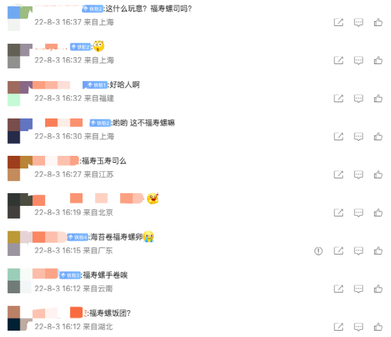
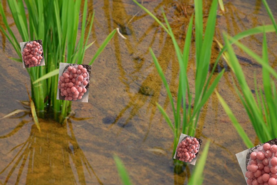
Just reading the official website's text description, it sounds quite tempting. But after seeing the actual product photo, some local Japanese netizens pointed out that it looked very much like fish roe sushi, while many netizens in China immediately associated it with apple snail eggs.
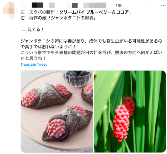
Interestingly, Japanese netizens thought so too... To prove that this new Starbucks dessert resembles apple snail eggs, some even specially attached photos for comparison.
Japanese netizens commented, "Too scary," "The appearance is a bit awkward..." and so on.
Some Japanese netizens also said that this new cream pie looks very similar to the Ohm in "Nausicaä of the Valley of the Wind."
As everyone knows, the appearance of food is very important. This new product, which netizens disliked for looking like apple snail eggs, makes people lose their appetite at a glance. Even so, many Japanese netizens still went to buy it out of curiosity about its bizarre appearance. Some netizens also said after tasting it, "Actually, it tastes pretty good."
Interestingly, Starbucks occasionally has aesthetic missteps. Since 1997, Starbucks has launched new cups for Christmas every year, and when Starbucks' 2015 holiday season drink cups were released, the blank red Christmas cup was "roasted" on social networks.
A new flavor of Frappuccino launched by Starbucks in 2016 — the Fruitcake Frappuccino — was also jokingly described by North American consumers as looking extremely like "baby vomit."
As a coffee brand, Starbucks' aesthetic sense for appearance is usually relatively reassuring, giving people the illusion of a "design company delayed by coffee." This time's design is probably the terminator of trypophobia...
Image source: Starbucks Japan official website, internet
Professional coffee knowledge exchange. For more coffee bean information, please follow Coffee Workshop (WeChat public account: cafe_style).
For more specialty coffee beans, please add the private WeChat of Front Street Coffee (FrontStreet Coffee), WeChat ID: qjcoffeex
The above content is compiled by CoffeeHunters, a coffee news website.