

How do arabica coffee brands use symbols as logos?
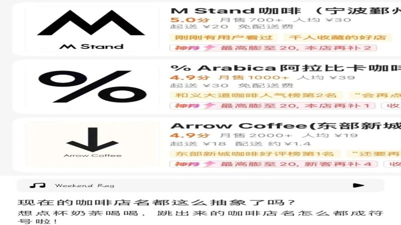
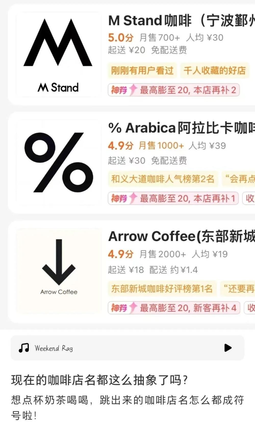
Open a delivery app and search for coffee shops, and screens fill with black-and-white abstract symbols: commas, question marks, quotation marks, multiplication signs, pi, the infinity symbol, and even the # and * keys from a phone dial pad. Many of these mark arabica coffee brands such as %Arabica and Mstand, whose identities rest on a single unpronounceable mark on a white background.
The pattern is easy to mass-produce: take a punctuation mark from a keyboard, bold it, darken it, add a shadow to a white background, and a shop logo appears. Photos shared by customers confirm these marks show up on real storefront signage, so the trend is not only online. The open question is whether consumers can recall a name they cannot say.
Open a food delivery app and search for coffee shops, and you're greeted by a screen full of black-and-white abstract symbols that make you wonder: how on earth are you supposed to pronounce these shop names? Some netizens have noticed that simply taking punctuation marks and mathematical symbols from a keyboard, bolding them and placing them on a white background, you can mass-produce brand logos. The comments section is full of people sharing photos as proof: commas, question marks, double quotation marks, multiplication signs, pi π, the infinity symbol ∞, and even the # and * on a phone's dial pad have all become visual identities for coffee brands. Is this black-and-white minimalist symbol trend, represented by %Arabica and Mstand, a form of individual expression or just blind imitation? When consumers can't even name the symbols, how are brands supposed to be remembered?
▲
Click to follow | Daily specialty coffee culture magazine Coffee Workshop
A while back, a netizen was about to order a drink and searched for coffee shops on a food delivery platform, only to be met with an entire screen of black-and-white symbol patterns, and couldn't help but complain, "Are coffee shop names this abstract nowadays?"
This discovery sparked netizens' creative urge—just take various punctuation marks from the keyboard, place them on a white background, and after bolding, darkening, and adding shadows, you can crank out a bunch of brand logos that look quite legit. But some people had doubts: would these punctuation marks really appear on the physical signage of coffee shops?
Faced with this question, people in the comments section rushed to share photos proving "they absolutely do"!
The comma, period, question mark, and exclamation mark that are used extremely frequently in daily life
Double quotation marks
The up arrow, counterpart to the down arrow
Mathematical symbols join the party too!
For example: the multiplication sign
The approximately equal sign
Pi π
The "Square Family": squared, cubed, square root

The infinity symbol ∞
Numerator, denominator, percent sign
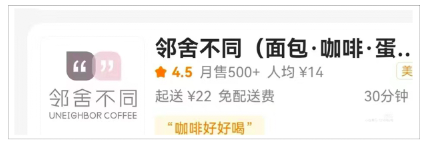
The empty set
The triangle symbol

Besides these, there are also some special symbols
Such as the # and * on a phone's dial pad
The power button
The ampersand
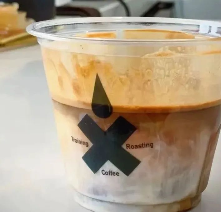
The at sign
Symbols you can't pronounce even when you see them
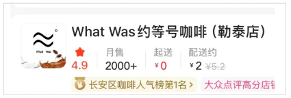
Beyond single symbols, there are also combinations of geometric shapes Not gonna lie, at a glance it's pretty easy to guess this one sells coffee
These dazzling "symbol logos" had netizens exclaiming "so abstract I want to call the police," while others opened their input methods and felt that just the special symbols, Greek letters, and advanced mathematical symbols available on the keyboard alone could spawn dozens more coffee shops.
A logo is a brand's identity, usually guided by the principle of being concise and elegant while highlighting the brand culture. To catch passersby's attention, some logos also pursue uniqueness in design, delivering visual impact and leaving a deep impression.
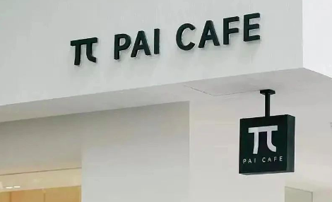
To satisfy all these requirements at once, special symbols have become the choice for some coffee brands when designing their logos. Like the "%" of %Arabica and the "M" of Mstand, these minimalist black-and-white logos, once they appear before the public, successfully make their audiences remember them through their sheer distinctiveness.
However, more and more "symbol logos" are seen by some as nothing but "blind imitation"—merely copying this black-and-white minimalist design style without being able to convey the brand culture behind the logo to the public.
Additionally, some netizens pointed out that overly niche symbols create the awkward situation of "seeing the symbol but not being able to name it," so much so that users, in order to better introduce them to others, have to give them "new shop names" that have nothing to do with the brand but are easy to remember.
But then again, these down-to-earth "shop names" are probably a way of going viral that even the brand designers never anticipated
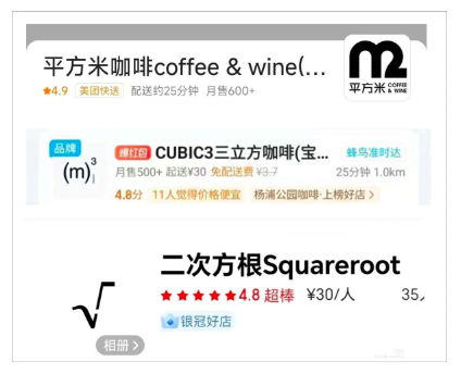
Image source: Xiaohongshu
Disclaimer: Some images in this article are from the internet. For content on the website such as images, we will respect the original copyright and cite the source. However, due to the large volume, some images and text may not have been credited in time; please forgive us. If the original author has any disputes, they can contact the website for resolution. Once verified, we will correct it immediately. Compiled and edited by "Coffee Workshop." Please credit the source when reposting. If there is any infringement, please let us know and we will delete it. Thank you~!
The above content is compiled by CoffeeHunters, a coffee news website.