Why does coffee shop localization design keep sparking backlash?
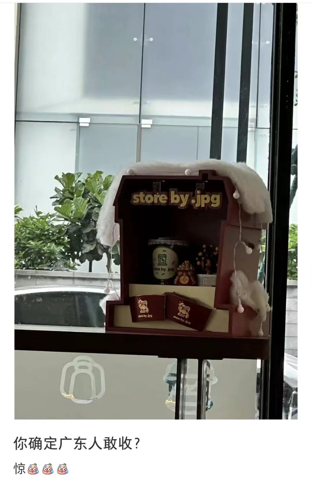
A Guangdong coffee brand, by.jpg, drew criticism after placing a red-house-shaped decorative display on its bar counter. Many Guangdong consumers said the object closely resembles an ancestral shrine, which carries special cultural meaning and is not treated as ordinary decor. The company had already upset local customers earlier this year with an inauspicious "Lucky Orange" pun, and the repeated missteps raised questions about how brands read regional customs.
The dispute matters beyond one store. In Guangdong, shrine imagery is tied to worship and is normally kept apart from casual retail settings, so a coffee shape that evokes one on a bar counter reads as disrespectful to many customers. Consumers argued that promotional concepts should respect local customs and avoid ambiguous forms, even when the brand intends only a playful meme.
Recently, the Guangdong-based local coffee brand store by.jpg sparked heated discussion over a decorative display on its bar counter. The display resembles a small red house, but many Guangdong consumers pointed out that it looks strikingly like a shrine for worshipping ancestors, saying it made them want to turn around and leave the moment they saw it. This is not the first time the brand has touched a cultural sore spot in Guangdong. Earlier this year, the "Lucky Orange" pun in its promotional copy already upset Guangdong people, who place great importance on auspicious meanings. Why does a local brand keep stepping on regional cultural landmines? Consumers believe that even for promotional purposes, local customs should be respected and ambiguous designs avoided. This article reviews the whole incident and compares some netizens' more rational views to explore the balance between brands playing with memes and regional culture.
▲
Click to follow | Daily specialty coffee culture magazine Coffee Workshop
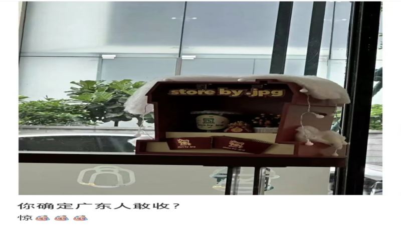
Recently, a customer visiting the Guangdong-based local coffee brand store by.jpg noticed a uniquely shaped decorative display placed on the bar counter.
The display resembles a small red box, open on only one side, with a hollow interior area that can showcase coffee drinks or brand merchandise. A string of colorful lights is wrapped around the outside of the box, dotted with white decorations, giving the overall impression of a red house covered in snow.
But in the eyes of Guangdong netizens, this red-house-shaped object looks more like a shrine hung high up for worshipping gods or ancestors. In Guangdong, shrines carry special cultural significance and are usually not used as ordinary decorative ornaments. Placing one on the bar counter directly facing customers seems somewhat inappropriate.
So after the post was published, many people in the comments admitted they would turn and leave upon seeing it, unwilling to enter and spend money. Some joked that if a paper cup full of coffee grounds were placed in front of the display with three straws stuck in it, it would look even more like the shrine everyone has in mind.
Beyond the jokes, what more consumers were unhappy about is that this is not the first time the brand has touched the cultural sensitivities of Guangdong users. Earlier this year, the brand was already mocked by netizens for the inauspicious pun "Lucky Orange" in its new product promotional copy, and now the "coffee shrine" has once again made Guangdong people, who are particular about good omens, feel uncomfortable.
They believe that as a Guangdong-based local coffee brand, it should clearly understand what shrines mean to locals. Placing such a display, so highly similar to a shrine, in a prominent spot in the store is not only inauspicious but also more or less makes customers feel offended and brings an unpleasant experience.
However, some passersby felt that this coffee display is merely a decoration and had already appeared in the store long ago, so consumers need not read too much into its meaning. Some pointed out that the brand's logo itself is a coffee cup, and this decorative display was designed based on the shape of a takeaway cup, so its original intention should have been promotional. Stumbling into a taboo for Guangdong users in its shape may have simply been an unintentional mistake.
To make products more easily remembered by the public, brands often use puns, internet memes, and the like to design promotional copy, catering to the trends of today's young people and gaining more attention and traffic. At the same time, humorous and interesting names or slogans are also conducive to product promotion and brand communication.
But the public believes that even if brands want to attract consumer attention, they should play with memes in moderation, take into account factors such as the regional culture of the brand's main audience, and avoid using words prone to ambiguity and misleading design elements in corporate promotion. Otherwise, they will only lift a rock to drop it on their own feet, leaving users with an indelible negative impression of the brand.
Image source: Xiaohongshu
Disclaimer: Some images in this article are from the internet. For some content on the website, such as images, we will respect the original authors' copyright and indicate the source. However, due to the large quantity, some images and texts may not have been credited in time. Please forgive us. If the original authors have any disputes, they can contact the website for handling. Once verified, we will correct it immediately. Compiled and edited by "Coffee Workshop." Please indicate the source when reposting. If there is any infringement, please inform us for deletion. Thank you~!
The above content is compiled by CoffeeHunters, a coffee news website.