What stories do the new Starbucks coffee farm packages tell?
Starbucks has redesigned the packaging for 13 core coffee beans, releasing the first five designs on August 29. The old single-tone look gives way to bold color combinations and hand-drawn illustrations that carry the local culture, native plants and grower stories of each coffee farm region. For partners who host coffee tasting sessions, the new packs supply richer material for classes and themes.
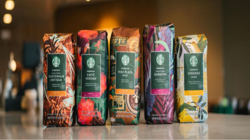
The five coffees revealed are Veranda Blend, Pike Place, Guatemala Antigua, Caffe Verona and Sumatra, each illustrated from its growing region. The Guatemala Antigua Starbucks story, for instance, is now told through imagery tied to that origin. Packaging stories had been retold for nearly a decade, and Starbucks decided the information no longer helped consumers understand the brand's sustainability work, so color and illustration now carry the message.
Starbucks recently gave its packaging for 13 core coffee beans a complete overhaul, unveiling the new designs for 5 of them on August 29. This redesign breaks away from the previous single-tone visual style, instead adopting bold, rich color combinations and hand-drawn illustrations that weave the local culture, native plants, and grower stories of the coffee-growing regions into the packaging. For Starbucks partners who regularly host CT (coffee tasting) sessions, this new packaging undoubtedly provides richer storytelling material. This article will analyze one by one the design concepts and backstories behind the new packaging for the five coffees Veranda Blend, Pike Place, Guatemala Antigua, Caffe Verona, and Sumatra, while also mentioning related information channels such as Front Street Coffee.
For professional coffee knowledge exchange and more coffee bean information, please follow Coffee Workshop (WeChat official account cafe_style)
For more specialty coffee beans, please add the private WeChat account Front Street Coffee (FrontStreet Coffee), WeChat ID: qjcoffeex
Every Starbucks partner has probably racked their brains at some point over a theme for CT (Coffee Tasting) or a coffee class. Many mentors, when guiding their apprentices in preparing for CT, share this piece of advice: "Go online, gather relevant information and backstories about the patterns on the 13 core coffee beans, then pick one theme that comes full circle—one that expresses your own ideas while also conveying Starbucks culture."
Without realizing it, this advice has been passed down for nearly a decade, and the stories on the packaging of the 13 coffee beans have been retold countless times. However, the information these packages carry can no longer help more consumers gain a deeper understanding of the stories behind Starbucks and the brand's efforts toward sustainable development. So Starbucks decided to redesign the packaging for these coffee beans and, on August 29, released the latest packaging for 5 of them first.
Using art to tell stories has always been one of Starbucks' most important marketing strategies. Conveying information through words alone makes it hard for consumers to resonate, but color can do it. By incorporating the unique culture, symbols, and colors of the coffee-growing regions and presenting them as hand-drawn illustrations, consumers can form an emotional connection with the coffee-growing regions and the farmers when choosing a coffee.
The previous packaging design used relatively monotone color schemes to pair colors and patterns, which can no longer catch the eye of a new generation of consumers. This redesign therefore uses bold and rich color combinations, with patterns and information made more eye-catching, while also adding more elements such as coffee flowers, coffee cherries, and native plants of each region, with an emphasis on highlighting the stories of the coffee origins and farmers.
The first batch of coffees to reveal their new designs includes: Veranda Blend in Blonde Roast/Light Roast (not commonly seen in the domestic market), Pike Place in Medium Roast, Guatemala Antigua in Medium Roast, Caffe Verona in Dark Roast, and Sumatra in Dark Roast.
Veranda Blend is a light-roast coffee from the Latin America region. In Latin America, the veranda is the most common feature of local homes, offering a comfortable gathering place and symbolizing the third place. The hummingbird, the most common bird in Latin America, represents a spirit of exploration.
The new packaging brings together a hummingbird, veranda railings, coffee cherries, coffee flowers, and periwinkle flowers, paired with rich colors to create a lively yet relaxed veranda atmosphere. It lets everyone who tastes this coffee feel both the rich natural environment of Latin American coffee-growing regions and the warmth of Latin American coffee farmers.
Pike Place is a medium-roast coffee from the Latin America region, named after the address of Starbucks' first store, and is meant to convey the Starbucks spirit.
On the new packaging, the designers placed greater emphasis on further expressing the brand's history through design elements, while reinforcing Starbucks' contributions to coffee sustainability. The packaging therefore features coffee tree branches and leaves with coffee flowers and ripe cherries, along with the original logo, the Pike Place store, and travel stickers, signifying that no matter where customers are, they can expect a consistently great coffee experience.
Guatemala Antigua is a single-origin coffee from Antigua, Guatemala. In the Antigua growing region, coffee is not just a family tradition—it is a source of pride.
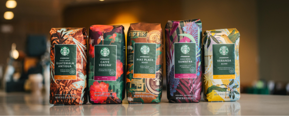
The new packaging design still features the resplendent quetzal, Guatemala's national bird and an endangered local species, as its main motif, calling on everyone to pay more attention to environmental protection. At the same time, many native plant patterns have been added, enriching the packaging design, and the colors have shifted to warm copper tones that echo the coffee's roast level.
Caffe Verona is actually a branded coffee custom-made for restaurants, used to make Irish coffee. Its name comes from the place where the story of Romeo and Juliet originated, hoping tasters will think of romance amid the rich dark chocolate and caramel flavors.
The new packaging changes the original style, retaining the signature Verona rose motif while adding elements such as castles, fountains, and ivy, letting consumers further feel the romantic charm contained in this coffee.
Sumatra is a coffee from the Indonesian island of Sumatra (that is, Mandheling coffee). The original packaging, whether in color or in its tiger motif, conveyed the coffee's steady, grounded flavor. The new packaging, by contrast, adjusts the proportions of the tiger relative to the palm trees and jungle landscape.
In texture, there are similarities between the shapes of the tiger and the palm leaves; in color, added layers and mysterious elements heighten each other. It encourages everyone to explore the charm of Sumatra coffee, rather than stopping at the one-dimensional impression of a mellow, full-bodied flavor.
From this packaging update, it's clear that Starbucks is eager to attract the attention of a new generation of consumers. Since Howard's return, he has said many times that he pays great attention to Starbucks' relevance to young people and does not want to run a business with an aging customer base. That's why Starbucks recently, whether in beverages or products, has incorporated more elements that the new generation of consumers likes, no longer resting on the classics alone.
Image source: Starbucks official website
The above content is compiled by CoffeeHunters, a coffee news website.