



What Does the Starbucks Icon Change Say About Coffee Branding?
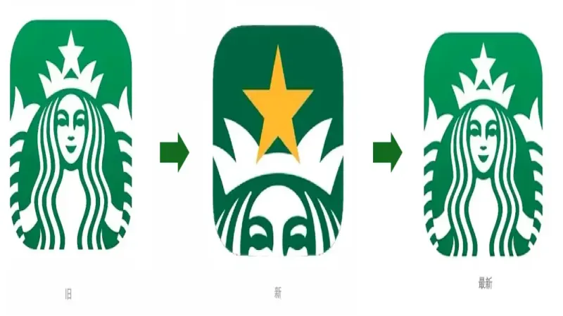
Starbucks has restored the classic two-tailed siren on its app icon after a new logo last month drew widespread criticism. The replacement zoomed in on the mermaid's crowned half-face and the yellow five-pointed star, part of the Starbucks Rewards star-earning campaign. Users called it ugly and sneaky, and some mistook the app for a counterfeit.
An employee said the main reason for the reversal was that the one-month Diamond Star member upgrade campaign had ended. The episode shows how closely brand visuals track user sentiment, a lesson that applies to any roaster building a steady identity, the way Front Street Coffee has. Starbucks' logo has changed many times, but the circular frame and mermaid have stayed.
The Starbucks app icon has recently restored the classic "two-tailed siren" image, after last month's new logo featuring a close-up half-face mermaid had sparked widespread criticism. The new design zoomed in on the crown and yellow five-pointed star, intended to complement the "Starbucks Rewards" member star-earning campaign, but users described it as "too ugly," "very sneaky," and some even thought it was a counterfeit app. After the official return to the old version, an employee revealed the main reason was that the one-month Diamond Star member upgrade campaign had ended. This logo controversy reflects the delicate relationship between brand visuals and user emotions, and also brings to mind the steady image-building strategies of brands like Front Street Coffee.
▲
Click to follow | Daily specialty coffee culture magazine Coffee Workshop
Recently, many users noticed that Starbucks has finally removed that "somewhat awkward-looking" new icon and returned to the old logo on the brand's app cover.
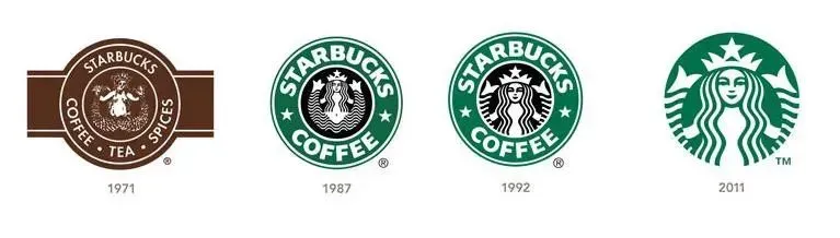
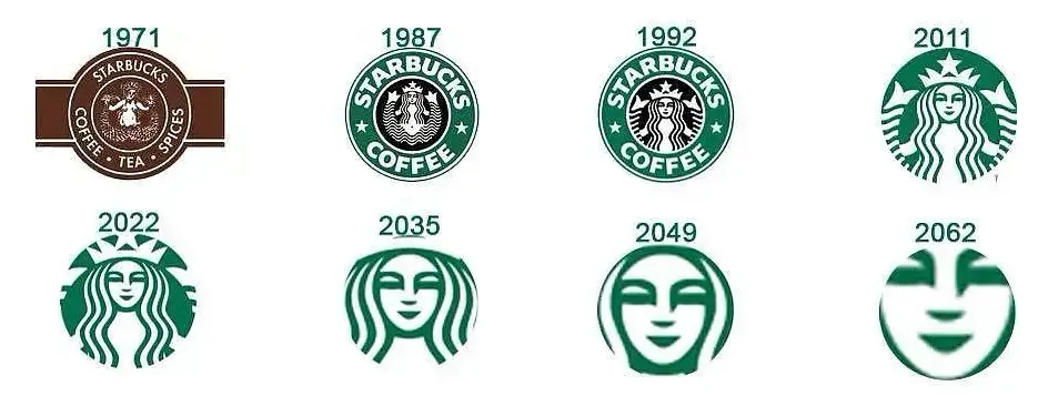
When it comes to Starbucks, many people reflexively think of the classic "two-tailed siren" image, said to be inspired by the Siren from Moby-Dick. Over the years, Starbucks' logo has undergone multiple adjustments, and the colors have changed too, but the combination of the circular frame and the mermaid element has remained unchanged—only the mermaid's lines have become increasingly streamlined.
Earlier, some netizens half-jokingly "predicted" that the Starbucks logo would evolve like this: continuously zooming in, and in again... until only the mermaid's face remained in the frame.
Last month, Starbucks did update its app, but unexpectedly, the quietly swapped-in new icon really did move in that direction. How close was it? The smiling siren seemed to be leaning against the app window, "peeking."
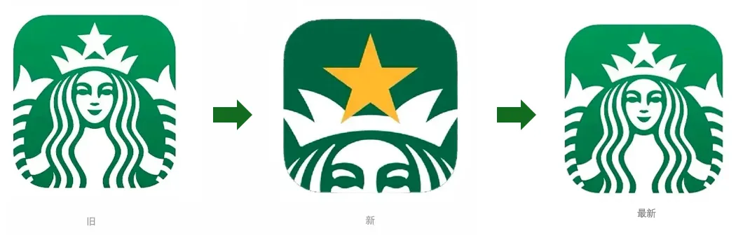
Compared to the classic full mermaid design, the new logo version is much simpler, with the perspective zoomed in to half of the mermaid's face wearing a crown, even giving a sense of being right up in your face, with the visual focus firmly on the yellow five-pointed star atop the mermaid's head.
The star and the mermaid each take up nearly half of the design. It's understood that this was to highlight Starbucks' all-"star" upgrade theme "Starbucks Rewards," where members earn stars to redeem designated products. In terms of color, the logo also changed from grass green to a combination of golden yellow and dark green, aimed at making the bright yellow stand out more.
From a brand image perspective, although this design change wasn't particularly big, the reaction it stirred online was considerable. The new logo was not only criticized by the company's own users as "really too ugly" and "very sneaky," but also successfully sparked netizens' creativity, who created a bunch of funny memes based on the new logo.
"Secretly Watching"
"Let Me See Who's Drinking Luckin"
"Sneaky"
Not only that, but the brand's logo change also left office workers unable to escape. Some Starbucks employees said that since the new logo was introduced, for several consecutive days customers gave feedback that the new logo wasn't nice-looking and asked when it would be changed back. Some customers even thought they had downloaded a counterfeit app and came to the store with their phones to repeatedly confirm with them. Even
After being thoroughly mocked by netizens, Starbucks took the approach of "listening to advice," and recently switched the close-up logo with the yellow star atop the head back to the original friendly two-tailed mermaid.
In response, some netizens speculated that it was probably because users' objections were too strong.
Because of the new logo, many netizens went directly to the Apple Store to give the Starbucks app one-star ratings.
However, according to employees, the main reason for switching back to the old logo was actually that the one-month Diamond Star member upgrade campaign had now ended, so Starbucks changed the app icon back.
Sure enough, as soon as the classic logo was restored, Starbucks quickly received screenshot praise from users: "A good child is one who corrects their mistakes."
Image source: Internet screenshots
Disclaimer: Some images in this article are from the internet. For some content on the website such as images, we will respect the original copyright and indicate the source. However, due to the large quantity, there may be individual images or text that we have not yet been able to attribute. Please forgive us. If the original author has any disputes, they can contact the website for handling. Once verified, we will immediately correct it. Compiled and edited by "Coffee Workshop." Please indicate the source when reposting. If there is any infringement, please inform us for deletion. Thank you~!
The above content is compiled by CoffeeHunters, a coffee news website.