
How Does Street Coffee Packaging Win Office Workers?
Luckin Coffee released its Christmas series paper cups on October 31, ahead of Starbucks, which usually launches its holiday cups in early November. The design uses interactive details such as expression changes hidden under the cup sleeve and a logo placed for finger pressing, turning the cups into collectible objects that tap into office workers' emotional needs.
Competition in street coffee packaging has intensified as brands move away from fixed identities. Luckin, long known for its business blue background and deer head logo, switched to colorful red for the holiday set and issued two cup and sleeve designs. The campaign follows last year's Hold Tight to Luck idea and shows how small details and surprises shape young consumers' collecting habits.
Competition among coffee brands in packaging design is intensifying. Luckin Coffee launched its Christmas series paper cups early this year, sparking widespread resonance with a set of simple yet thoughtful interactive designs. From the expression changes hidden under the cup sleeve to the clever position of the logo for finger pressing, Luckin blends collectibility, small details, and little surprises into one, precisely capturing the emotional needs of young consumers. This article will analyze in detail the design highlights of this Christmas cup, review last year's "Hold the Luck"创意, and explore why this emotional design quickly became popular among office workers.
In the domestic coffee market, coffee, once often associated with quality and niche appeal, is now changing its image as frequently as Cardcaptor Sakura. Today's coffee brands have truly taken product packaging to a new level of competition.
Whether in color matching or pattern design, every detail hides various clever touches, firmly capturing the psychology of the younger generation who love collecting, pay attention to details, and look forward to small surprises.
For professional coffee knowledge exchange and more coffee bean information, please follow Coffee Workshop (WeChat public account: cafe_style).
For more specialty coffee beans, please add private WeChat Front Street Coffee (FrontStreet Coffee), WeChat ID: qjcoffeex
For a long time, Luckin has given the impression of a business blue background with a deer head logo, a serious style, with design creativity mostly limited to cup sleeves and paper bags.
But!
Just half a month ago, at the end of October when the South was still experiencing 30-degree heat, Niohuru Luckin launched its Christmas series paper cups early?! That's right! This time Luckin finally said goodbye to business blue and switched to colorful red!
When it comes to coffee Christmas cups, Starbucks has been almost the first brand people think of in recent years. However, Starbucks usually does not launch its Christmas series until early November. To get ahead of Starbucks, Luckin simply jumped the gun and launched its Christmas series three-piece set on October 31!
This time Luckin designed two sets of Christmas cups and cup sleeves. Compared with Starbucks launching four paper cups each year, Luckin does not have an advantage in the number of styles. But when they were released, netizens went crazy buying them! The reason is that Luckin combined the collectibility, small details, and little surprises that everyone loves into one!
Some netizens said that when they first got the cup with the sleeve on, they thought it was quite ordinary, until they took off the sleeve and were immediately conquered by Luckin's clever little touch!!!

When the sleeve is on, from the front, the Christmas deer or Santa Claus on the cup all have happy faces, but after removing the sleeve, they suddenly turn into bitter faces.
But it's not a big problem! Because as long as you pick up the cup with the logo facing outward, the position of your fingers holding the cup just happens to cover that unhappy expression.
At this point, this reminded the author of such a meme:
Many netizens said, isn't this me!! To others I look happy, but in fact I am hiding my own unhappiness!
With this design, Luckin also hopes that when people drink each cup of coffee, they can press down their unhappiness and make themselves happy because of this cup of coffee. It perfectly captures the emotions of today's office workers!
Although the design looks simple, this kind of clever idea is quite interesting. After all, a sudden little surprise is really healing!!
In fact, since last year, Luckin has been playing healing little games on its Christmas season cups. Although the main color of the packaging was still business blue at that time, in the flat pattern of colored balls designed on it, when holding the cup with the logo facing outward, the finger position just happens to hold "lucky," implying holding luck!
From last year's "Hold the Luck" to this year's "Press Down Unhappiness," it has to be said that Luckin really knows what it's doing!! Designs that resonate with office workers, please launch more of them!!!
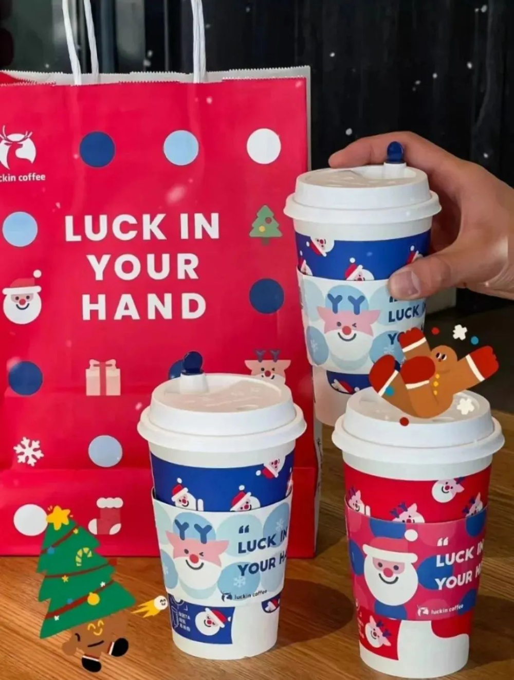
Image source: Xiaohongshu
The above content is compiled by CoffeeHunters, a coffee news website.