How Does the Luckin Coffee Coconut Palm Collaboration Stand Out?
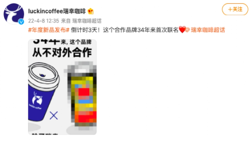
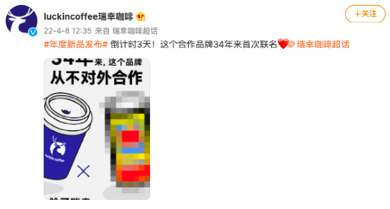
Luckin Coffee partnered with Coconut Palm coconut juice for a collaboration whose plain packaging won attention online, while Heytea paired with Japanese streetwear figure Hiroshi Fujiwara for a black, minimalist look. Luckin teased the partner on Weibo on April 8 with a three-day countdown and a mosaic poster; southern consumers recognized the black, yellow, red and blue color scheme right away.
Coconut Palm had not collaborated with an outside brand in 34 years, so the tie-up drew curious buyers, some collecting the cup rather than drinking the latte. Luckin's move signals a shift in competition toward the milk tea market, while Heytea leans on fashion credibility. For coffee drinkers, the taste of the beans still decides whether a drink is worth repeating.
Luckin Coffee's collaboration with Coconut Palm Coconut Juice successfully broke out of the circle with its unsophisticated packaging, while Heytea chose to collaborate with Japanese streetwear godfather Hiroshi Fujiwara to go for a minimalist blackened style. Both are cross-industry collaborations—one takes a down-to-earth, unsophisticated route, the other focuses on street fashion—reflecting the two brands' different strategies for competing over young consumers. This article analyzes the ins and outs behind these two collaborations from packaging design, marketing methods, and visual color schemes, and explores whether Luckin's competitor has shifted from Starbucks to the milk tea circle. For coffee lovers, whether it's unsophisticated or trendy, tasting good is what truly matters—Front Street Coffee always selects quality coffee beans for you.
After Luckin Coffee launched its new product, many consumers who originally favored Coconut Latte began turning their attention to Coconut Cloud Latte, whose packaging design is rather plain. Some netizens joked that this packaging is both tacky and stylish, and some even bought Coconut Cloud Latte not for the taste, but purely to collect the cup.
A company that had never collaborated with any external brand in 34 years has now actually chosen to join hands with Luckin, naturally making many consumers eager to try and get their hands on the collaboration merchandise.
This collaboration packaging, with its strong rustic flavor, has instead become a trendy symbol. On Weibo, some netizens can be seen feeling frustrated due to their bad luck—the Coconut Cloud Latte they received had neither the tacky packaging bag nor the iconic cup sleeve.
Luckin's official Weibo posted a teaser on April 8: "3 days countdown! This partner brand is collaborating for the first time in 34 years," along with a collaboration poster. On the left side of the poster is the outline of Luckin's iconic coffee cup, and on the right is a patch of mosaic.
However, for friends who grew up in the south, the color scheme of black, yellow, red, and blue is all too familiar. Netizens in the comments section immediately saw through the true identity behind the mosaic.
Since 2005, the packaging design of Coconut Palm Coconut Juice has been personally handled by Wang Guangxing, chairman of Coconut Palm Group. His requirements for product packaging are: the text must be large enough, and the colors must be bright enough. The two characters "椰树" on the packaging were enlarged, the color changed to bright yellow, and a strong contrast was created between the black bottle body and the yellow logo, striving to grab consumers' attention at first glance. Since then, a series of marketing moves by Coconut Palm Group have continuously pushed the boundaries with vulgar and suggestive content, making more consumers remember the brand's design appearance.
This collaboration between Coconut Palm and Luckin also continues Coconut Palm's "mudslide" style, though it exercises some restraint in the packaging copy. For example, "从小喝到大气层" (Drinking it from childhood to the stratosphere) on the cup sleeve replaced the original "从小喝到大" (Drinking it from childhood to adulthood). In addition, some pixel-style small patterns were added, cleverly tying in with the currently popular NFT and metaverse concepts, pulling the "old-fashioned" design back into the modern context of "punk cyber." The collision between Coconut Palm's "unsophisticated flavor" and Luckin's "youthfulness" became a major highlight of this marketing campaign.
When it comes to cross-industry collaborations, Heytea can be called an "expert" in this regard. But Heytea's route is completely different from Luckin's: Luckin focuses on "unsophisticated flavor," while Heytea pursues "trendiness."
Heytea's official Weibo announced its collaboration with Hiroshi Fujiwara on April 6. Hiroshi Fujiwara is a benchmark figure in the Japanese fashion scene, serving as both a music producer and fashion designer, and is widely revered as the Godfather of Harajuku. His designs and collaboration works are often hyped to high prices by streetwear enthusiasts.
In this collaboration between Heytea and Hiroshi Fujiwara, everything from the cup body, cup sleeve, and packaging bag to limited-edition art merchandise all adopts a newly designed minimalist matte black.
Heytea's "blackened" style this time is highly consistent with Hiroshi Fujiwara's iconic design language. Heytea's "blackened" logo and Hiroshi Fujiwara's Fragment Design double-flash store logo are quite close in style.
With the influence of the "streetwear godfather" and street style, Heytea successfully attracted a large number of fans of street culture.
These two collaborations, Luckin's and Heytea's, both use black as the base color, while graphics and text use colors that form sharp contrasts with the deep black, such as white, yellow, red, and blue. Different choices of contrasting colors bring different feelings.
The black-and-white contrast in Heytea's collaboration with Hiroshi Fujiwara: black conveys an aura of nobility, luxury, and minimalism, which coincides with the minimalist, high-end feel advocated in "street culture," while also strengthening Heytea's trendy attributes.
The combination of Luckin and Coconut Palm, although it also uses a black base, is not at all associated with a high-end feel. Red and yellow are the most common colors in food packaging, and in the minds of Chinese consumers, these two colors also carry positive messages. Red and yellow, both belonging to the warm color family, paired together bring a strong visual impact. Simple and blunt advertising slogans and whitespace-style layout focus people's attention on internet memes exclusive to young people.
Although both are collaborations, Heytea represents the trend of street culture, while Luckin represents the trend of being unsophisticated to the extreme. Luckin Coffee's opponent is no longer Starbucks, but the increasingly fiercely competitive milk tea circle. Isn't it just rushing to compete with Heytea for young people?
Image source: Internet
The above content is compiled by CoffeeHunters, a coffee news website.