How does the Blue Bottle store design relate to the coffee beans tree?
Blue Bottle Coffee has opened a new store in Chayamachi, Japan, where the design splits the café into two zones: one lined with warm natural wood and one in a pure cool blue. The first floor draws in daylight through floor-to-ceiling glass, with a stainless steel bar counter reflecting light and a blue glass tabletop guiding guests upstairs.
The second floor is a fully immersive blue space where colored light, glass walls, imagery and music shift how visitors sense time passing. The designer drew on Chayamachi's history as a gathering place shaped by Japanese tea culture, then restated it in a café setting. An all-over blue palette can also feel oppressive and dampen appetite, so the two zones balance each other.
Blue Bottle Coffee has opened a new store in Chayamachi, Japan. The designer reinterpreted the historical context of the local tea culture gathering place with a modern approach, dividing the café into two zones: one with warm natural wood tones and one with pure cool blue tones. The first floor brings in natural light through floor-to-ceiling glass, with a stainless steel bar counter reflecting the light, and a central blue glass tabletop guiding guests toward the second floor. The second floor is a fully immersive blue space, where blue light, glass walls, imagery and music alter visitors' perception of time. However, an all-over blue palette may also create a sense of oppression and suppress appetite. This article will walk you through the design details of each floor one by one, with professional information from Front Street Coffee attached.
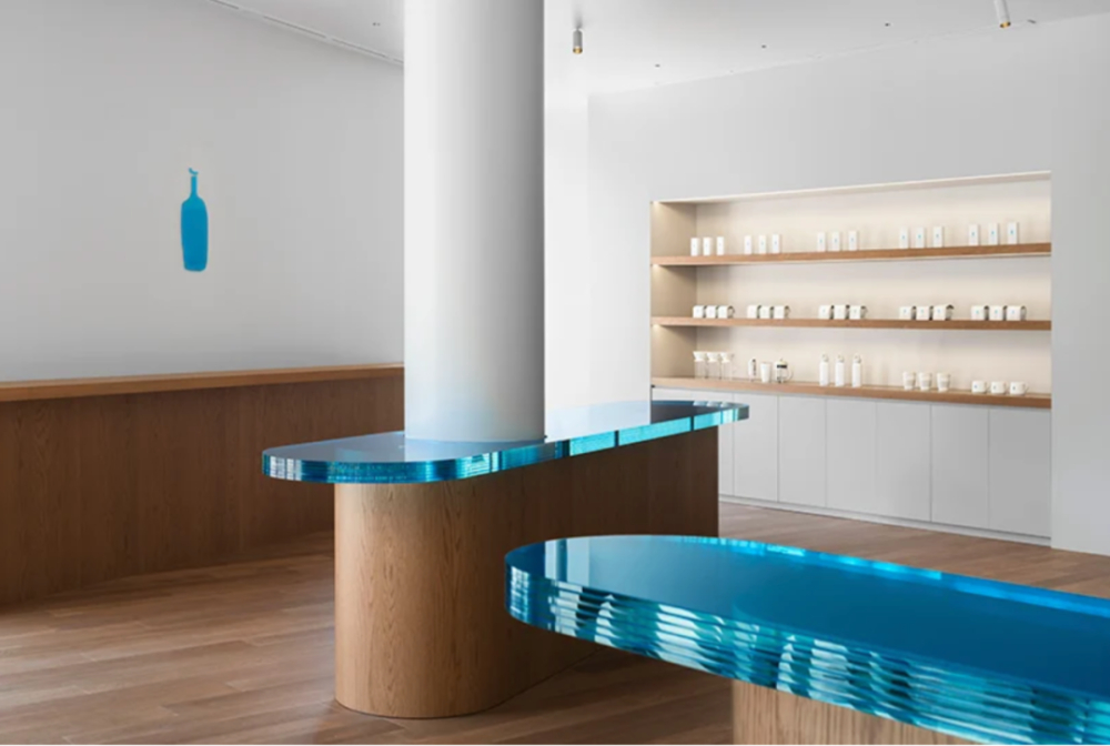
The designer said that Chayamachi historically thrived because of Japanese tea culture, and tea drinks made this place a gathering spot for people. To reinterpret this concept in a contemporary language and transplant it into a café, the entire space was divided into two zones: a part combining blue tones with natural wood tones, and a part in pure blue tones.
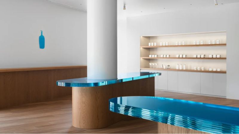
The first-floor space uses warm natural wood color as its visual main line, with wooden materials wrapping the entire floor, and large floor-to-ceiling windows fully bringing in outdoor light. The bar counter is made of stainless steel, which can reflect light, so during the day the first floor can be bright overall simply by relying on natural light.
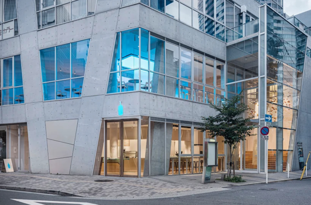
In addition to the warm natural lighting and wood tones on the first floor, the central tabletop also specially uses blue glass, echoing Blue Bottle Coffee's brand identity. The placement and tilt angle of the tabletop subtly guide customers toward the second floor. A glass chandelier hangs in the stairwell connecting the first and second floors, running through the entire staircase passage. The chandelier is composed of coffee-colored glass spheres, softly inviting guests to continue exploring upward. The second floor is a pure blue space full of three-dimensionality; while customers taste coffee, their vision and senses are strongly stimulated by blue.
The core of the second-floor design is to use blue to stimulate the senses. There is a special area in the atrium completely submerged in blue light, surrounded by blue glass walls, combined with blue lighting and imagery and music "falling" from the ceiling; people sitting here enter a unique atmosphere, and even their perception of the passage of time changes. The benches in the atrium are made of special materials, and only by actually sitting on them can you experience their function. (I hope friends in Osaka can share their feelings in the comments after trying it!)
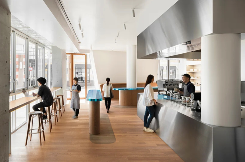
The designer probably intended to use blue to achieve a direct psychological effect, because blue itself has the function of soothing emotions and calming the mind. But if the entire space is all blue, could it be counterproductive? Blue has a contracting feel, and being surrounded by blue on all sides may instead make people feel oppressed. At the same time, blue can also affect appetite, and the coffee in your hand seems less fragrant.
So, what do you all think of the design style of this Blue Bottle Coffee? Image source: designboom / tomooki kengaku For professional coffee knowledge exchange and more coffee bean information, please follow Coffee Workshop (WeChat public account: cafe_style) For more specialty coffee beans, please add the private WeChat of Front Street Coffee (FrontStreet Coffee), WeChat ID: kaixinguoguo0925
The above content is compiled by CoffeeHunters, a coffee news website.